
I rebranded the Red Deer Pickleball Club to better reflect the energy and community at the heart of the sport.
Problem:
The existing brand was outdated and difficult to reproduce. It relied on a simple monogram and deer icon, but didn’t capture the social, welcoming spirit that defines the club.
My solution:
I shifted the focus to what makes the club special—the social connection. The concept centers on the post-game paddle tap, building a dynamic and flexible identity around that moment.
The colour system draws from the environment and the game itself: court and sky blues, competitive red, ball yellow, and a friendly teal, with green used sparingly as a nod to outdoor courts.
The site includes:
- Logo variations and flexible colour formats
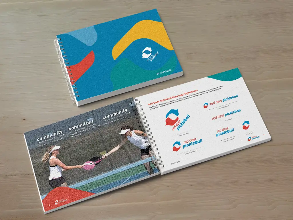
- A detailed brand guide defining usage and consistency
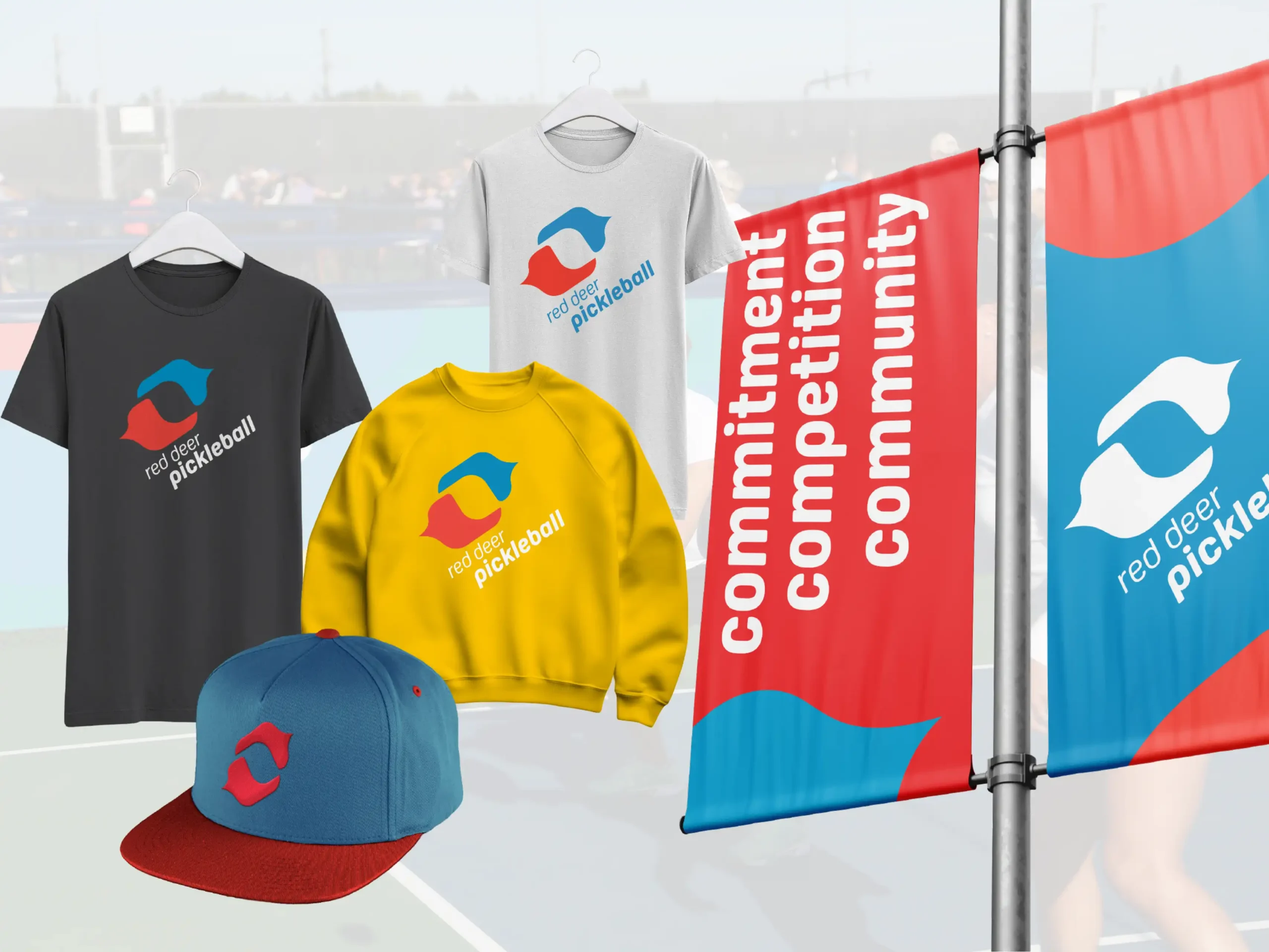
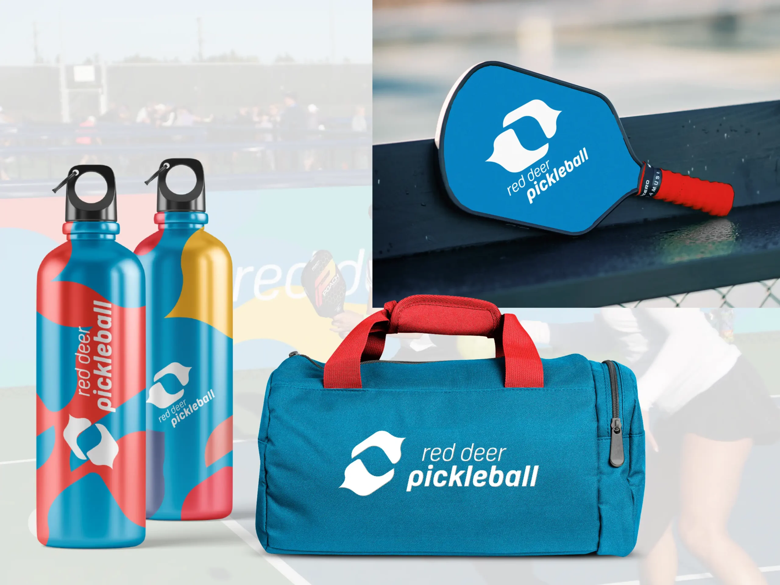
- Mockups for merch, signage, and future applications
I also supported hosting setup and repair for their self-hosted environment, and tightened their existing logo while preparing a clean file kit for signage and print. (It may be one of the most elegant brand guides I’ve created.)
Result:
The new brand is bright, social, and dynamic—focused on friends, community, and the energy that keeps players coming back.
Details
Client: Red Deer Pickleball Club
Industry: Sports Organization
Service Area: Red Deer, Alberta and surrounding area