

Well, it’s election time again in Canada and Canadians are busy listening to the parties and their platforms. Now, it may be more efficient if the parties would wait a bit longer before calling an election, we seem to get elections more often than we get spring, but we all have to play the hand that’s dealt to us, and get out there and vote.
Now what’s really key in this election, in our view, is not platform, it’s not star candidates and its not scandals. It is clear, the major issue is… who has the best election website? Let’s break it down:
The clear winner for “cool factor” is the Bloc Quebecois
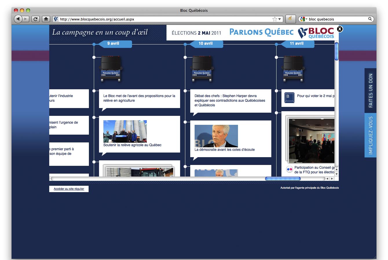 It’s worth visiting the Bloc just to see the ultra amazing campaign schedule at the bottom of the site. Looks like flash… but it isn’t. This is an amazing achievement and it’s really cool. It’s interesting, though – as it’s hard to tell what the average Quebecer gets out of this – they mostly won’t see the campaign bus outside of metro areas. But heck, the BQ doesn’t have to actually campaign on policy, they just complain a lot and stuff happens.
The Social Media Crown?
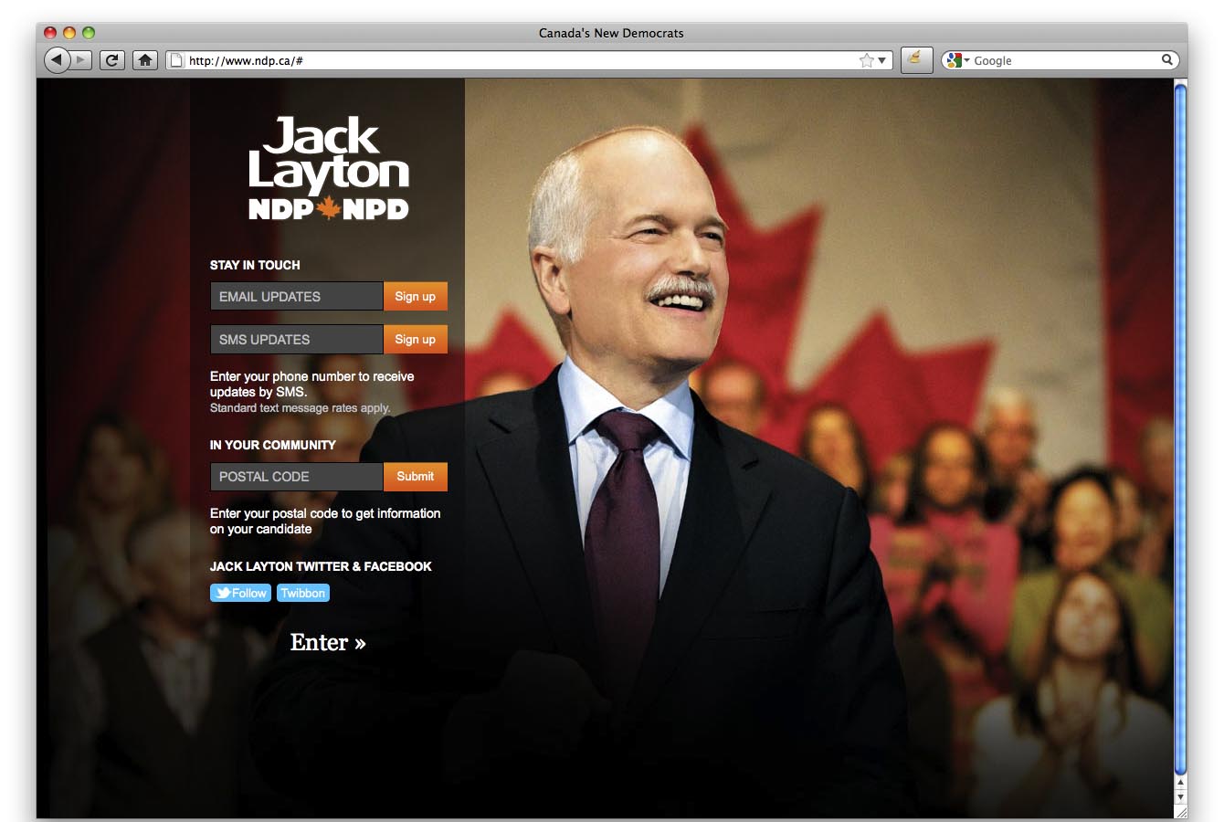
 This is a close battle between the NDP and the Libs. The NDP have done a great job of building social links into every article. They also have a stunning landing page, as long as you can stand an enormous photo of ol’ Jack. The site also includes a very easy to navigate, but visually unexciting platform.
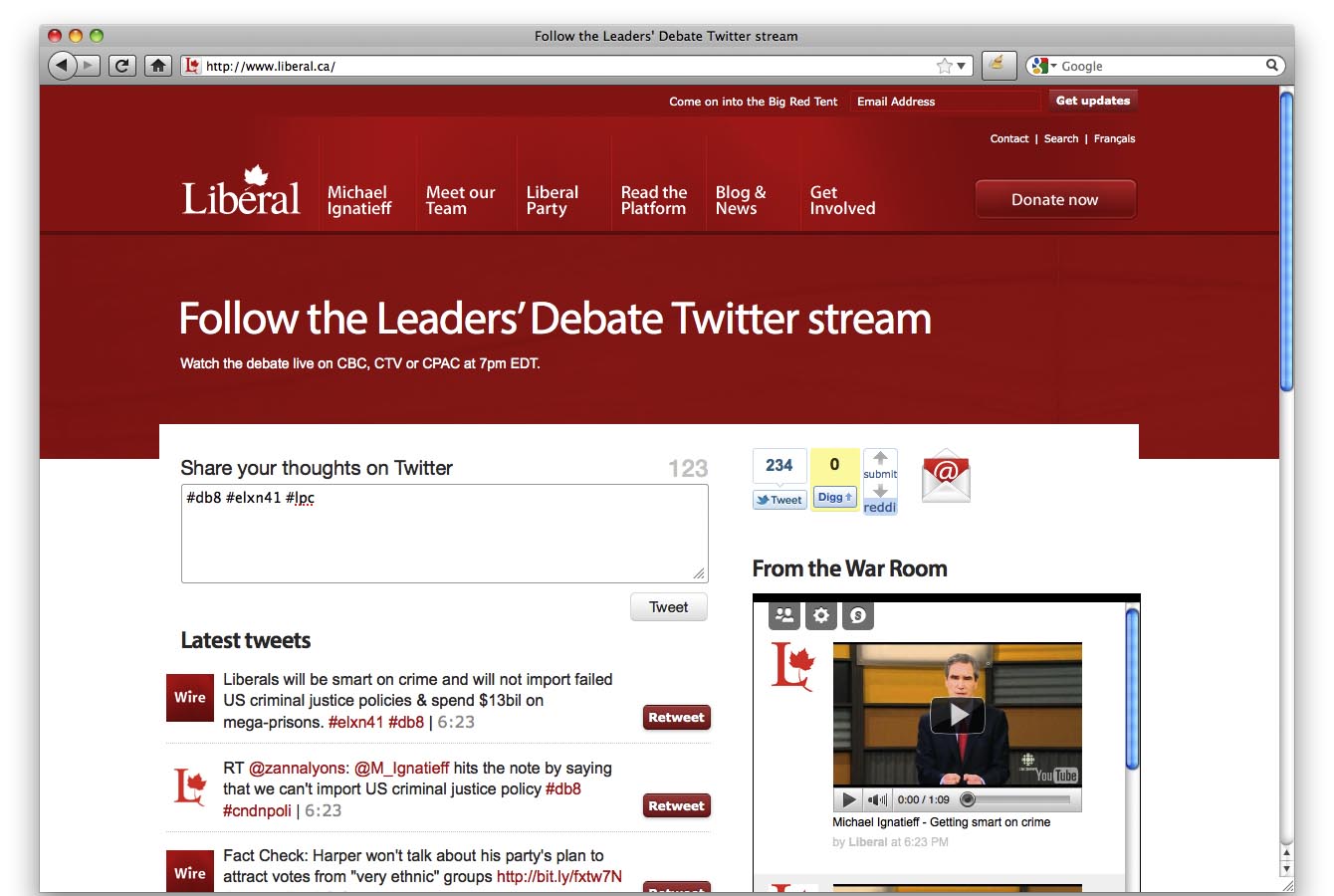
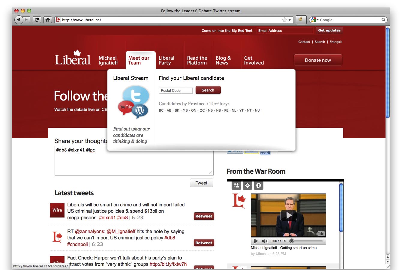
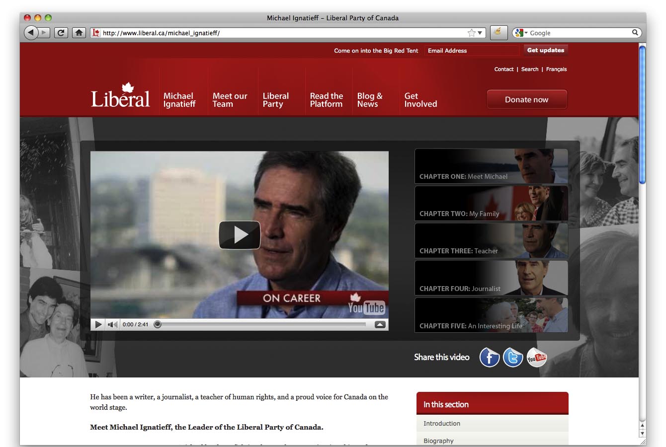 The Liberals installed a completely different homepage featuring twitter for the debates. Risky? Perhaps, twitter can be a bizarre place. But they also have more video integrated directly into content that the other parties, not hidden on a “video” page. In addition, they have an intuitive sub-navigation structure that offers greater depth and a secondary message with each selection. The Liberal site appears “deeper”. Answering the NDP platform tool, the Liberal platform is also easy to navigate and also is very graphically rich with graphs, data and video.
And the Losers?
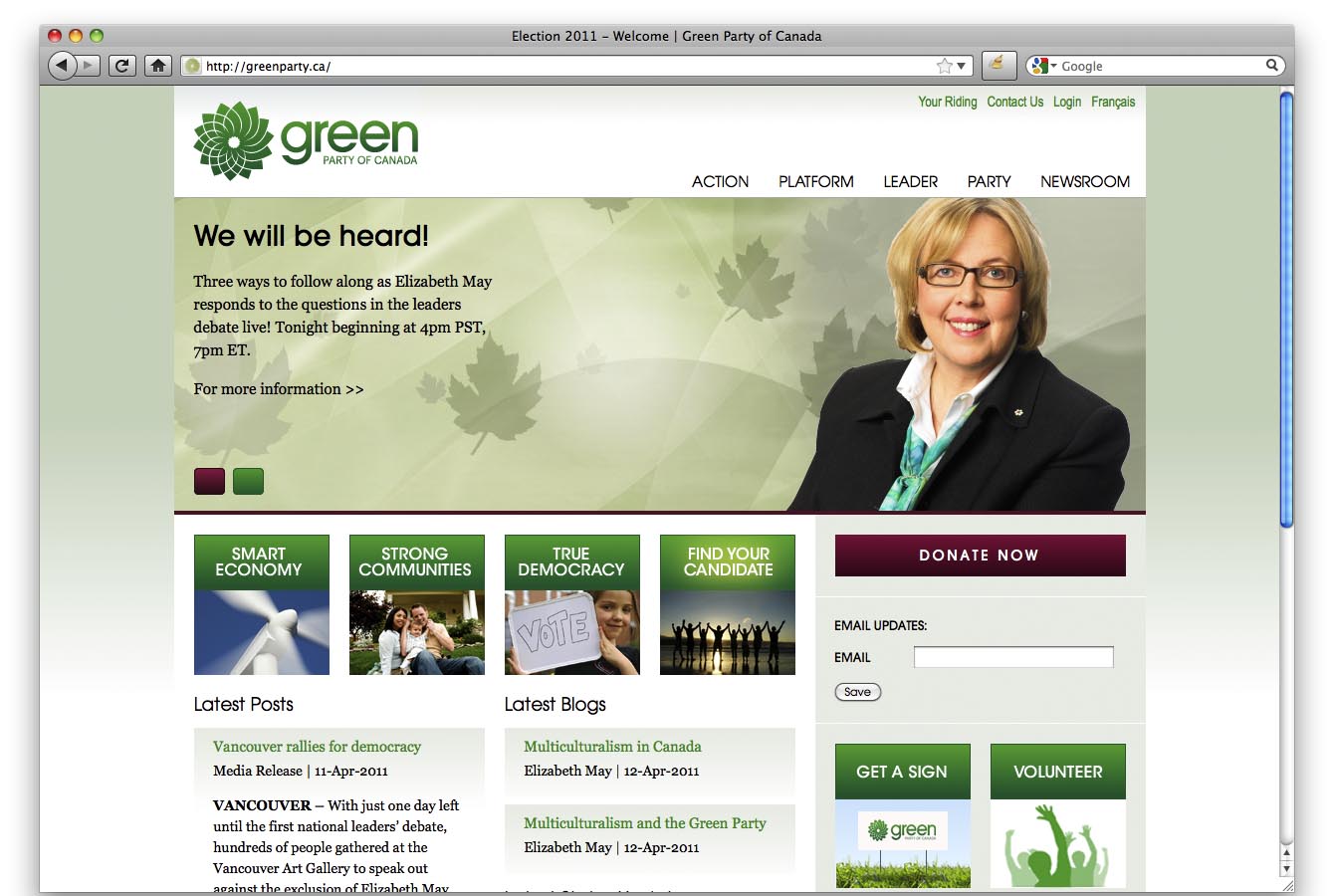 I have to say this was a surprise. The Greens, with all their youthful pinache, apparent vitality and new ideas have a more boring site. It’s really just what you expect, and I find their choice of burgundy for a second colour a bit odd. The Platform function is reasonable, and the site is very clean. No headline grabbing showboating like the Bloc, but perhaps content says it all? Not in this review!
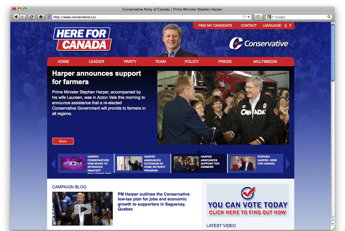 The Conservatives, who are last, seem to care more about fundraising than policy, have very little attention paid to social media and the platform page is basically a pdf download. The crowning jewell of this site? It’s the only site of the bunch that actually promotes voting!
The crowning jewell of this site? It’s the only site of the bunch that actually promotes voting!
I have to say, strictly from a visual perspective, the conservative site is clearly the ugly duckling. Primary blue, primary red and white? For a party that often gets heckled for being too American this seems like a completely insane choice. Elizabeth May selected a burgundy so close to purple, its weird. Doesn’t she know purple is the number 1 colour hated by the average male in North America? Still, the ol’ stars and stripes colour palette in the conservative site, coupled with their main message of “give us money” clearly mark this site a failure.
So who should YOU vote for?
Don’t ask us. This post is not about policy. It’s a light hearted review of some nerd’s handwork. Read the platform pages on the above sites and make a decision, but most of all, vote. Otherwise we’ll end up like Venezuela. Seriously.
I got great enjoyment from this blog, as a fellow nerd– and it warms my heart to know the Cons have a terrible website 😉
Furthermore, all parties fail in that none of their sites use source code that is valid based on the W3C code validatior. Interesting.