
From Orangemen to Riverdawgs — this was a full identity overhaul with teeth.
When the Red Deer Lacrosse Association approached me about designing a logo for their recently renamed square the Riverdawgs, I jumped at it. A chance to help a community team reinvent itself as the Riverdawgs — a name with bite, motion, and a bit of mischief. Big shift from the old name: Orangemen.
Setting the Tone
We kicked things off by defining the boundaries:
- Simple. not complex
- Allegorical not literal
- And the big one: no dog portrait
Moodboards, loose sketches, style explorations — the usual creative chaos. Then something clicked.
Finding the Wave
We zeroed in on this zoomy, aggressive river‑wave form. It had energy. It had motion. It broke down beautifully into a monogram swash that felt fast even when standing still. I loved it immediately.
Then the team said, “Okay… maybe a dog face.”
So we brought the dawg back — bursting out of the torrent like it’s hunting scoring chances. Teamwork creates pressure, pressure creates goals. The water pressure metaphor basically wrote itself.
Iterate, Iterate, Iterate
Refine the wave. Refine the dawg. Refine the type. Repeat until it all snaps together. Once the board approved the final direction, we built out the full brand system.
Deliverables
A complete identity package, including:
- Primary logo
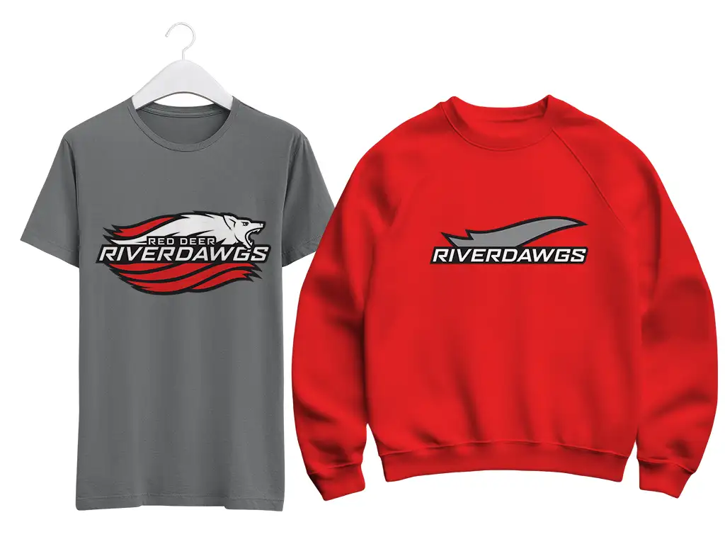
- Monogram (maybe my favourite)
- Wordmark
- Alternate wordmark with swash
- The swash itself (because it deserved its own file)
PLUS colour variants for red, grey, black, and white, and a full suite of production‑ready files.
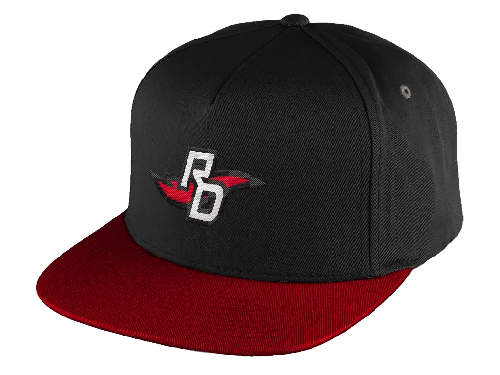
We mocked up merch so the team could visualize the brand in the wild — shirts, hoodies, the whole deal. Then wrapped everything in a mini brand guide with colour specs, file index, and usage notes.
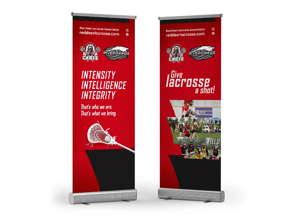
To top it off, I designed two banner stands: one for grabbing attention from across the gym, one for explaining the sport once people wander over.
Why I Loved This One
Community projects hit different. Seeing kids running around wearing something I designed — that’s the good stuff. The Riverdawgs are going to look sharp out there.
Details
Client: Red Deer Lacrosse Association
Industry: Sports & Recreation
Service Area: Central Alberta