Yes. Mistakes happen. Yes. We make them. Mistakes teach designers what they’ve missed, and what they don’t know. Mistakes also give us the opportunity to show integrity, and to make things right. I think mistakes are the single greatest opportunity to show you care about clients. Will you abandon them or make it right? Will you take your lumps or be indignant? Heroes don’t often rise when nothing is wrong.
I think mistakes are the single greatest opportunity to show you care about clients. You rise and fall on your reaction to errors.
We had a stationery project go bad this month. It was a collection of small things that culminated in a botched print run. Here’s the synopsis:
- We failed to communicate the appropriate nature of the print process (how the colours would look)
- The printer mixed the ink a little too light (light enough to matter, since we wanted it dark)
Now, in this case it has turned into a lot of extra work for us. We don’t make a lot of profit on a the average stationery package, and reprinting certainly hurts us. The printer, who has to reprint the package, also incurs costs by re-doing the order. But we are focused on the client, and a positive outcome. Does this mean we will re-print every order that’s a little bit off? No. But we always strive for the best and understand there is a margin for error in everything. The first thing everyone should know is that printing is an in-exact science. Paper and ink react differently on different days, different mixes, and different finishes. The absolute match many brand managers yearn for is often impossible. And good luck matching vinyl at the sign shop where the colour options are totally different. Most printers have gotten so consistent that their margin of error is so tiny, we have all gotten used to a consistent quality level and forgotten printing is indeed in-exact.
The Solution
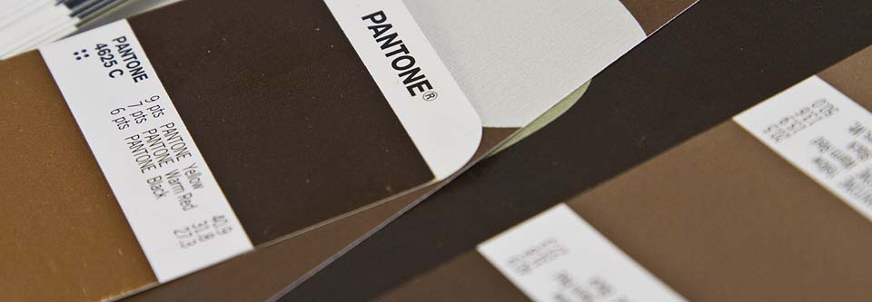
In this case, the we worked with the printer, and they used their experience to do a custom ink mix to match our clients perceived outcome. The printer saved the day here, make no mistake. The final product will look terrific! We aren’t printing a pantone ink anymore, but a custom match. Now we have the formula to repeat this project and minimize colour variance. Our mistake was not doing this in the first place – we should have confirmed the intended outcome first, not last.
The key is education!
- Understand that uncoated paper often “lightens” the ink colour and coated paper looks denser and often “darker” is a key factor. When looking at swatches, look at the appropriate swatch book. In this case, the paper finish created a lighter shade, and we wanted a darker shade.
- Don’t be afraid to look at custom matches. It’s a premium service that will cost money, but it’s well worth it once you have the formulas for what you want created and can use them in the future.


Good on you Brian, a very professional attitude that will come to reward you. Red Point rocks.