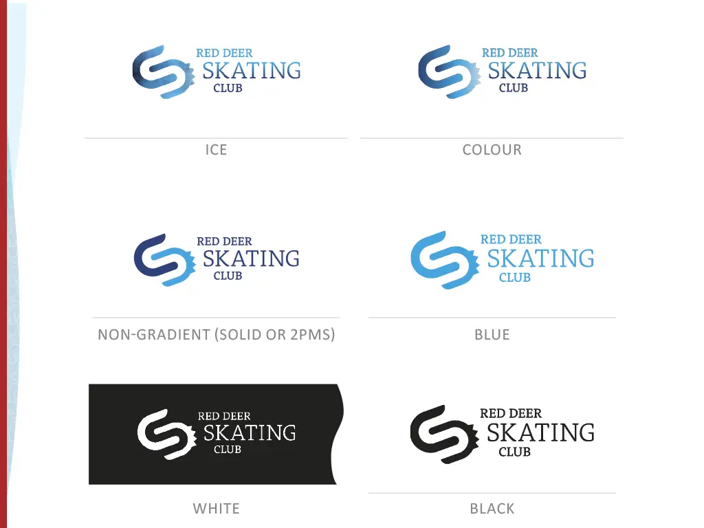
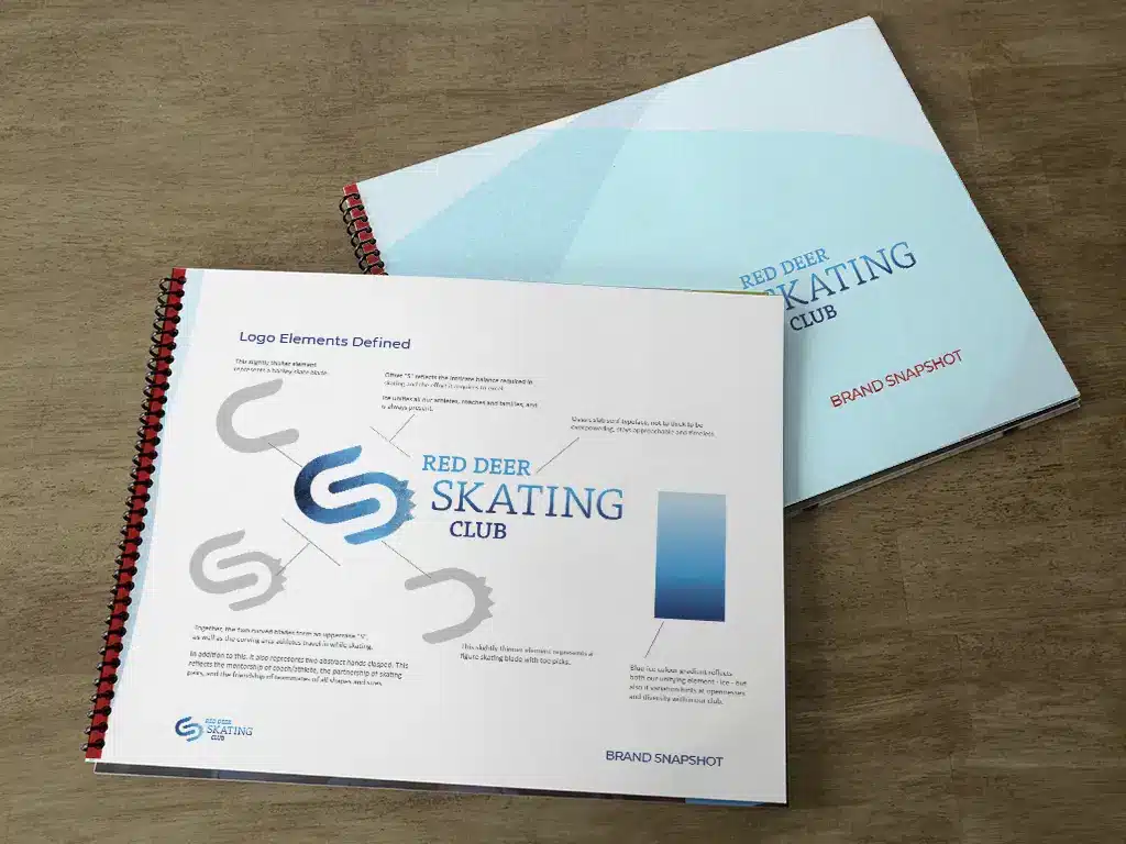
The Red Deer Skating Club brand is a medley of many symbols, just like the club – serving figure skaters, performance hockey skaters, first time children and adults. The logo itself is a smooth hockey skate blade and a figure skate blade with picks forming an “S”. They also for two hands clasping, representing partnership, friendship, and inclusion.
The brand also includes colour palettes for more ”hockey” feel and the more “figure skating” themes. There are also patterns to choose from, to help convey certain feelings, depending on the application. This brand actually has many dozen files in its archive!
Details
Client: Red Deer Skating Club
Industry: Recreation
Service Area: Central Alberta