
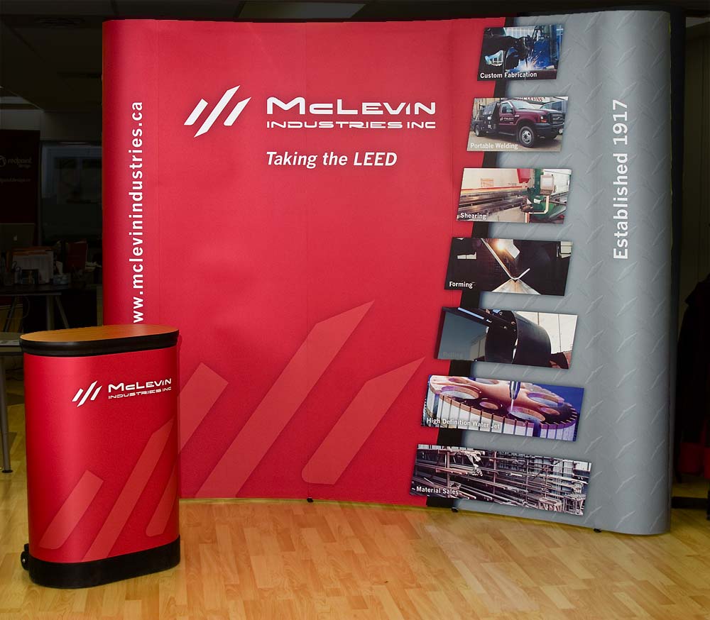
I refreshed the brand for McLevin Industries, one of Red Deer’s long-standing family-owned businesses, as they prepared for a generational transition.
Problem:
Their existing branding and signage dated back decades—likely to the 1980s—and no longer reflected the strength or professionalism of the company. They needed an identity that honoured their history while positioning them for the future.
My Solution:
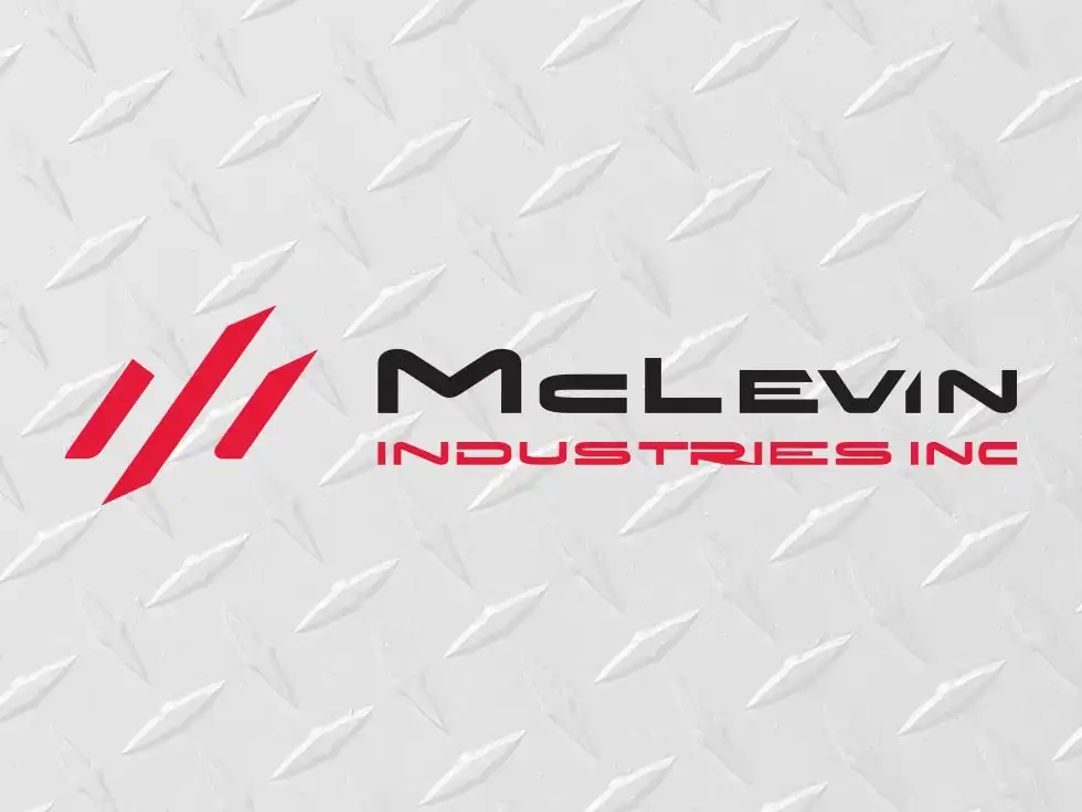
I designed a new logo built around a stylized “M,” referencing both steel forms and an ancient alchemy symbol for strength. The goal was to create something timeless, solid, and industrial.
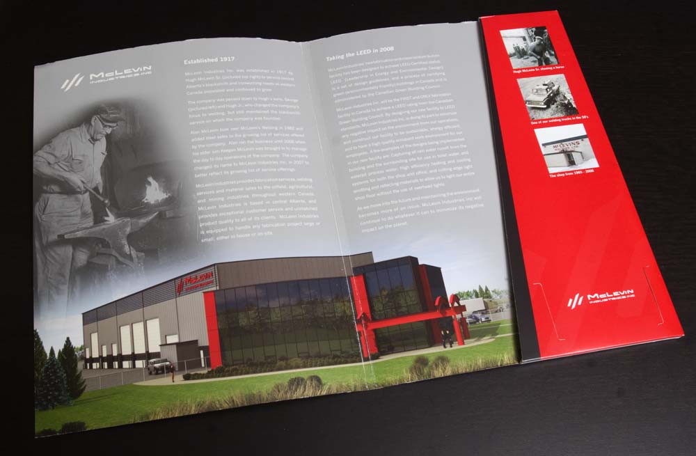
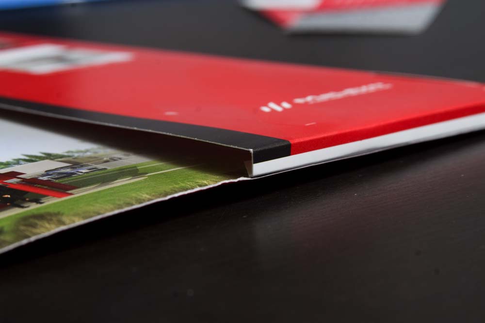
From there, I extended the brand into print and display:
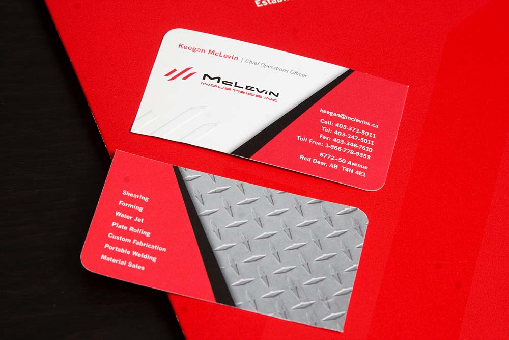
Business cards with blind embossing, alternating rounded corners, and silver metallic ink
A 9-foot trade show display with a full set of branded panels
Result:
The updated identity gave McLevin Industries a stronger, more cohesive presence—bridging their legacy with a more modern, confident look.
Project Details
Client: McLevin Industries
Service Area: central Alberta