

Many of you have visited the Redpoint office. It is bright, open, and even has a “homey” feel. It is a space that we love. It gives us room to grow, create, move, work, and hang out. On the negative side, the walls are in need of a paint job. The baby blueish grey washes out colour, and mixed with fluorescent light can make one’s complexion look blotchy and translucent. The colour also just dates the office, and hinders our creative environment. Or maybe we’re just being picky? An office makeover may be in the works… so we have to ask the question, to paint or not to paint?
People make judgements based on their surroundings. Certain colours produce certain reactions. (Thanks to a Colour Theory class I took a few years back) Beautiful surroundings instill trust, and positivity. Also, while perceptions of color are somewhat subjective, there are some color effects that have universal meaning. Warm colours (yellow, orange, red) evoke emotions ranging from feelings of warmth and comfort to feelings of anger and hostility. Cool colours include blue, purple, and green. These colors are often described as calm, but can also call to mind feelings of sadness or indifference. That said, are our office walls making the Redpoint team, and those who enter sad or indifferent? Perhaps not the best for a lively and creative environment.
We like red. Redpoint likes red, and kind of is… red. We have a red couch, red chairs, red folders, red moleskine notebook, etc… So it would only make sense that we paint a large feature wall in the office… red, right?
We like red. Redpoint likes red, and kind of is… red. We have a red couch, red chairs, red folders, red moleskine, etc… So it would only make sense that we paint a large feature wall in the office… red, right? But what does colour psychology have to say about the colour red? Red is associated with love, warmth and comfort. It is a bright, warm colour that brings out intense emotions. Red can also be considered intense, or angry that creates feelings of excitement. Perhaps these emotions will help fuel a creative environment? I think so, as long as we don’t go overboard.
To contrast the red feature wall, the rest of the walls we’d like to paint a deep charcoal, with a brown undertone. To finish it off, we thought the colour would really pop with an off-white trim. The large row of north facing windows brings in a lot of natural light, to avoid feeling to dark.
What do you think about our paint ideas?
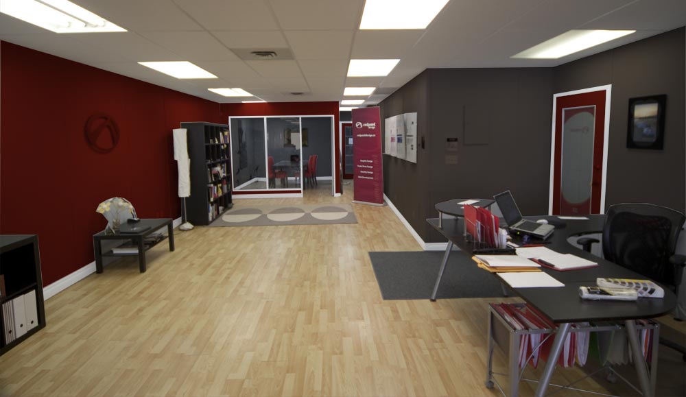
Paint Theme 1
Paint Theme 1
office_0863_paint2
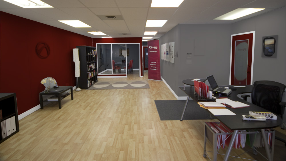
Paint Theme 2
office_0863_paint3
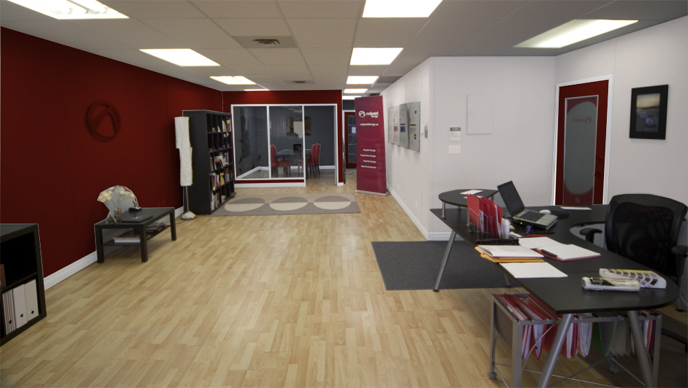
Paint Theme 3
office_0863_paint4
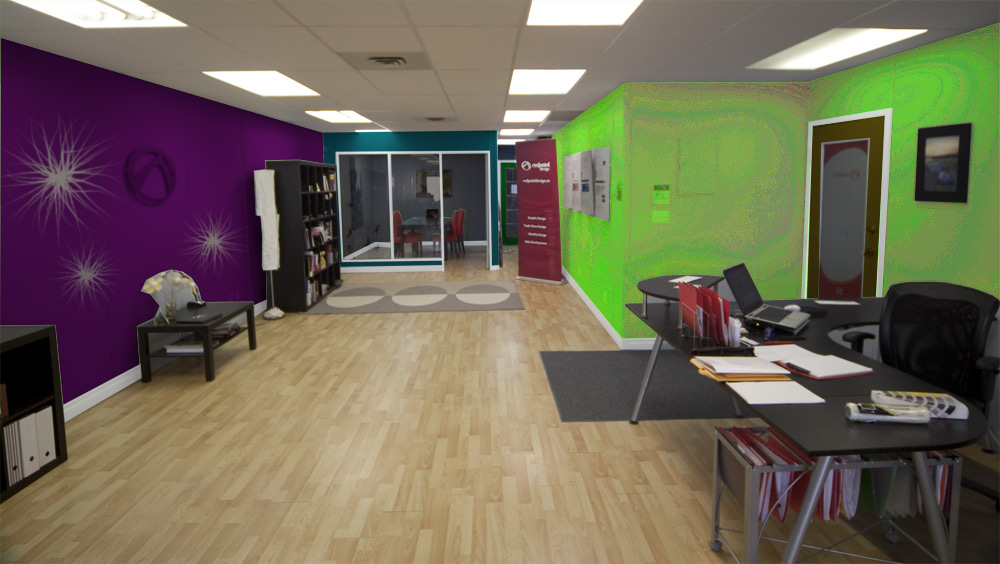
Paint Theme 4